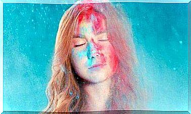
How Colors Affect Us
Marketing uses all possible means between earth and sky to achieve the set goals. In addition, we make use of all available means to get a particular product or idea to our attention. One of those aids is colors and their use.
Marketers have also found that certain colors can influence our decisions as consumers, and they make the most of this information in practice. Colors are used in marketing campaigns to create a certain kind of public image for a brand or product, in the hope that this created image would sympathetically influence purchasing decisions about it.
“Color psychology” is a field that specializes in analyzing the effects of different colors and shades on our thoughts and behavior. The information obtained from these studies is used not only in marketing but also in art, architecture, education, design, etc.
How do colors make us buy things?
Depending on the nuances chosen by the company’s creative minds, a product or an entire brand may be a huge success or a total pancake. Colors really have such a big impact. They may modify and define the perceived value of a particular product, our desire to buy it, the feelings it evokes, and so on.
Our perception of each color depends on our personal experiences, yet there are also universal rules about how colors affect us; the emotions and impressions evoked by a particular color tend to be similar within populations .
Globally, the most significant trademarks and logos are designed on the basis that each color is associated with specific concepts. As follows:
Yellow
Represents optimism, warmth and clarity. Examples of trademark logos that use this color are: Best Buy, Subway, Shell, Nikon, Chevrolet, UPS, IKEA, Ferrari and McDonalds.
Orange
Represents friendship, confidentiality and trust. The companies that have chosen this color are: Nickelodeon, Fanta, Mozzila, Crush, VLC, Amazon and Gulf.
Red
It tunes and excites the senses. Examples: Coca-Cola, Nintendo, Kellogg’s, CNN, Exxon, Lego, Pinterest and Canon.
Violet
Represents creativity and imagination. Some of the brands that have chosen this color are: SyFy, Yahoo, Taco Bell, Lynx, Barbie and Cadbury.
Blue
Represents trust and seriousness. Examples of products with this nuance include: Dell, HP, Oreo, Oral B, Walmart, WordPress, Vimeo, Twitter, and American Express.
Green
Represents peace, health and growth. Brands associated with this color include: Tropicana, John Deere, Monster, Spotify, Animal Planet, Android, and Starbucks.
Black and white
Together, these represent ease and balance (gray can also be used). Examples: Cartoon Network, Apple, New York Times, Wikipedia, Puma and Nike.
There are also those who have chosen more than one color for their logo. This has been done by Google, NBC, Windows and Ebay, among others. In these cases, the goal is for the client to experience one more experience .
Why do we choose a brand because of its color?
According to the study “The Impact of Color in Marketing”, 90% of consumers estimate the value of a product based on its color. In addition, we make color choices based on our feelings and emotions. In practice, this means, for example, that we do not choose something yellow or orange if we are depressed.
Colors affect us in significant ways. For example, we may feel different in our office if it is painted in dull colors than if it is painted in more appealing colors. Colors can help us rest better, study, be calm, enjoy our home, etc. So why couldn’t companies “tell us” what to buy or where to spend?
In addition to what strategic planning companies use to get our attention, our experience also matters. For example, if your favorite color is green, then you are more likely to buy products that use that shade. In addition, because of the example, in this case it is also more difficult for you to choose a product that is, for example, blue or orange.
If you want to test this in practice, then go to the store and do an analysis of what gets our eyes ’attention, you’re sure to notice that much brighter colors like yellow. But this does not mean that we always end up buying an optimally colored product, but there are other things that need to convince us. But in the end, those are all the elements we’re willing to evaluate because the product initially caught our attention.
The solution to this is to differentiate products, not by their color, but by their quality, price, or usability. In this way, we are conscious consumers, not just robots, ”